| Compiled by: Karel van der Waarde 2024 | |
| | |
| |
| | |
| Colofon & notes | |
|
|
Warning labels
There are plenty of different kinds of warning pictograms. Displays on vehicles, public signage, on pack warnings, Globally Harmonized System of Classification and Labelling of Chemicals (GHS), ...
Emery SB, Hart A, Butler-Ellis C, Gerritsen-Ebben MG, Machera K, Spanoghe P, Frewer LJ. (2015) ‘A Review of the Use of Pictograms for Communicating Pesticide Hazards and Safety Instructions: Implications for EU Policy’. Human and Ecological Risk Assessment: An International Journal. 21(4), 1062-1080. [DOI].
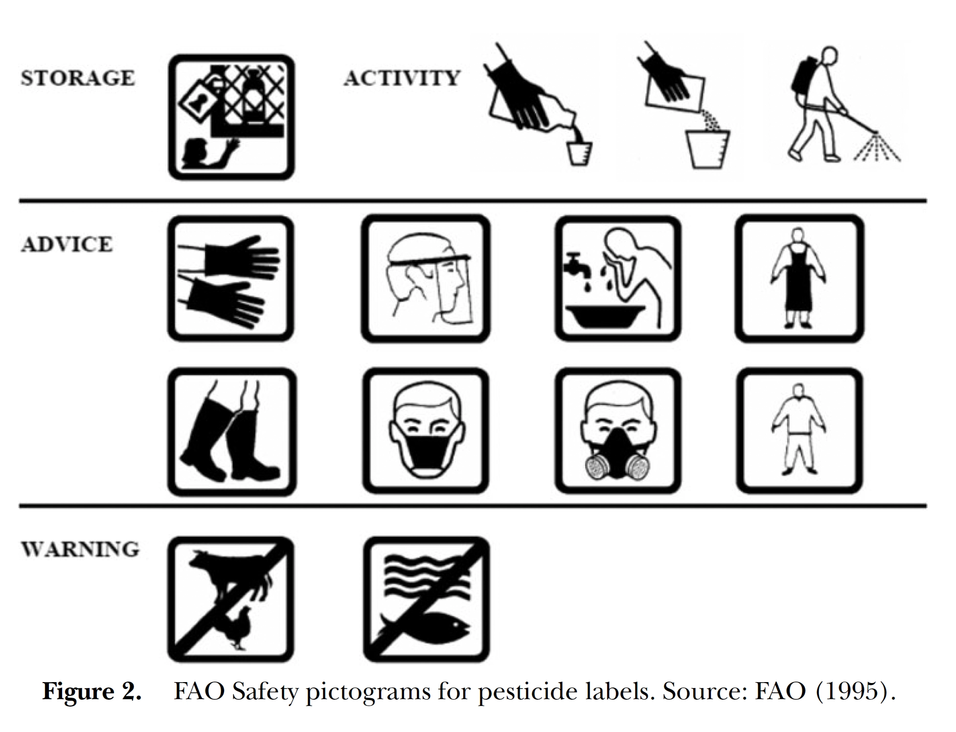
Aim of visuals: Pesticide exposure risk communication.
Method: Literature review
Effect of visuals: The results indicate that the understanding of pictograms used on pesticide labels by workers and operators is generally low. Pictograms can be used to complement training, facilitate recall, and encourage compliance. However, the majority of the literature suggests that pesticide pictograms are of limited effectiveness in terms of getting attention, conveying information, and, particularly, in encouraging compliance behavior (page 1071).
Suggestions for design: Table 2 gives some design factors to 1. attract attention (location, size, colour, contrast, format), 2. elicit existing knowledge (use of well known terms, signal words, connotation, brevity, format, explicitness, use of pictorials), 3. enable compliance (attention and knowledge factors, explicitness, pictorial symbols).
Suggestions for policy: -
Comment: This article clearly shows that pictograms are not easily understandable, culturally neutral, or universally understood (page 1074). The pictograms do not use text, nor do they indicate the level of risk.
Bearth A, Buchmüller K, Bürgy H, Siegrist M. (2020) ‘Barriers to the safe use of chemical household products: A comparison across European countries’. Environmental Research. 180, 108859. [DOI].
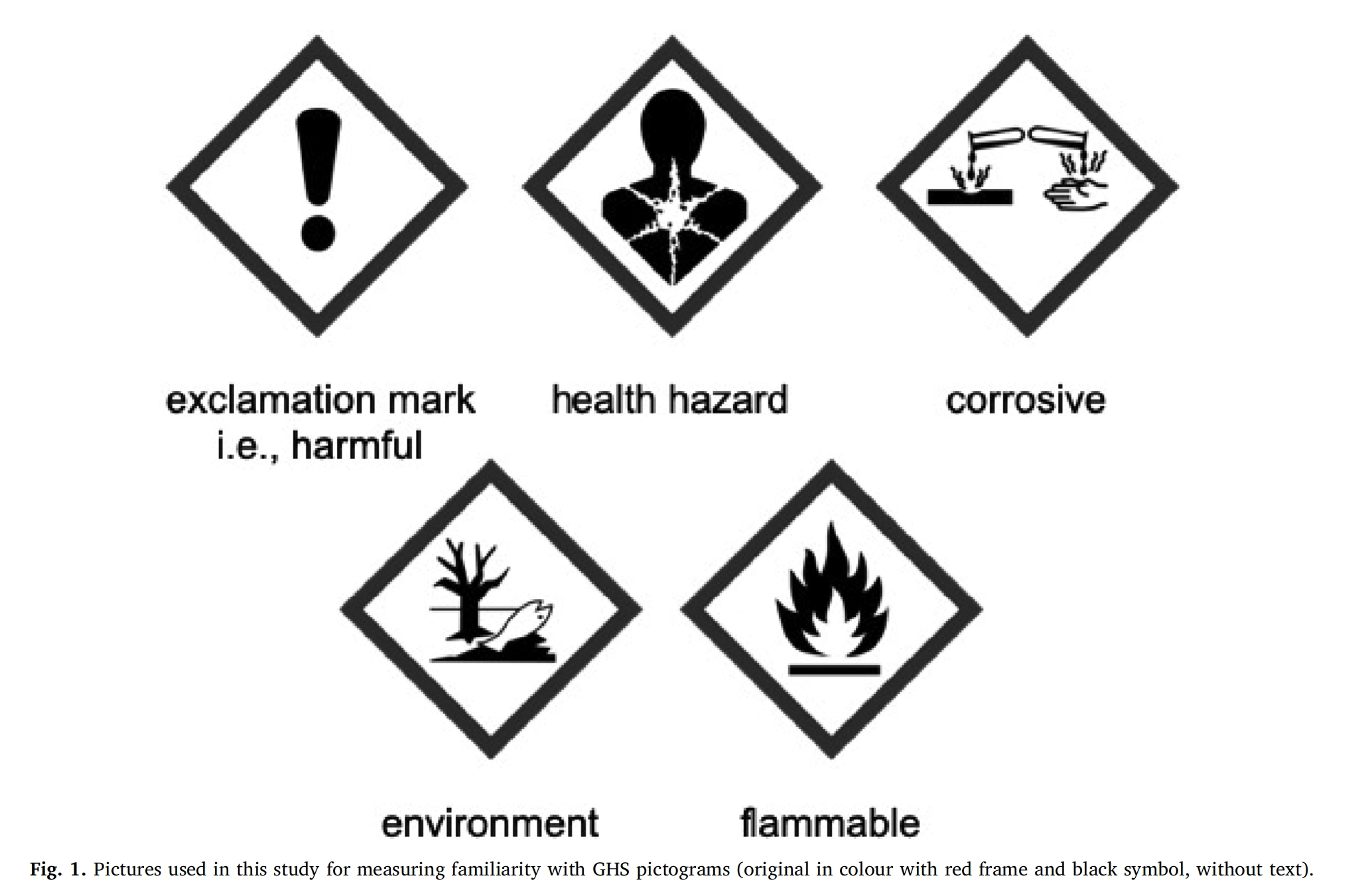
Aim of visuals: Risk communication about chemicals
People: Total: N=5631, Austria: N=731, Switzerland: N=698, Germany: N=711, France: N=708, Italy: N=695, Poland: N=693, Sweden: N=682, UK: N=713
Method: questionnaire for online survey
Effect of visuals: The best scoring pictogram was ‘flammable’: 91,3% recognised this. ‘Corrosive’ was recognised by 56,4%, and ‘Harmful’ by 50,6%.
Suggestions for design:
Suggestions for policy: Risk awareness and familiarity with the meanings of the GHS pictograms need to be raised to improve people’s abilities to recognise potentially dangerous household chemicals.
Comment: Figure 1 shows the ‘pictures’ (not ‘pictograms), in black and white (not in colour), and with a text (not without). It is not clear what the participants really looked at during the online experiment. Only the pictogram for flammable reached an acceptable score. 43% did not recognise corrosive, and 49% did not recognise a warning for harmful. None of the pictograms shows people what to do. The cause of not recognising is related to an inability of people, but the quality of the design of the pictograms is not questioned. Could it be the case that these pictograms are using unsuitable pictorial and schematic components?
Laughery KR, Wogalter MS. (2006) ‘Designing Effective Warnings’. pp. 241-271 in R. Williges (ed.) Reviews of Human Factors and Ergonomics, Vol. 2. Santa Monica, CA: Human Factors and Ergonomics Society. [DOI].
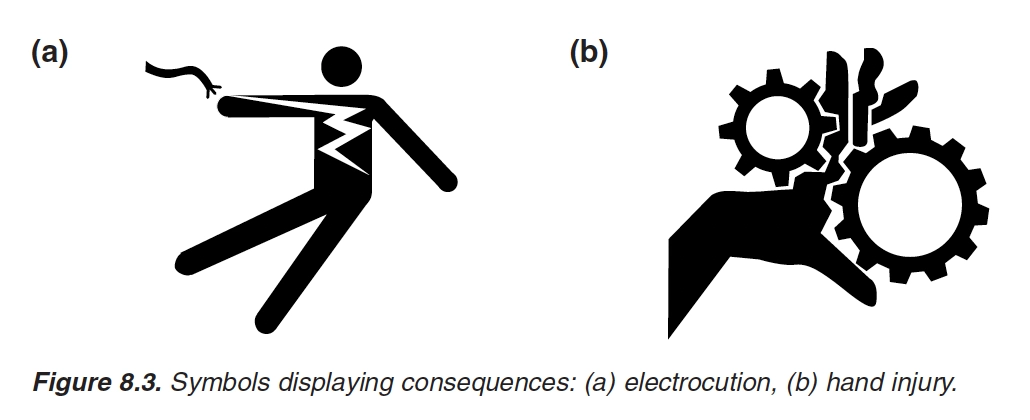
Aim of visuals: A purpose of warnings is to make the world a safer place. Design factors and nondesign factors that influence warning effectiveness.
People: Review.
Method: Review.
Effect of visuals: As a general principle, pictorials that directly represent the information are preferred, particularly for general target audiences. Pictorials that require inference or learning are less likely to be recognized or understood.
Suggestions for design: The article lists design factors for warnings: size, location/placement, color/contrast, signal word, and the presence of a pictorial. Symbols displaying hazards, consequences, and instructions. Symbols also attract attention.
Suggestions for policy: a warning should accomplish are to capture attention and to provide the information needed for people to make informed decisions regarding compliance.
Comment: The article nicely highlights that pictograms show hazards, display consequences, and provide instructions, also on the use of pictorials. [waste-sorting labels might do the same?]
Adams A, Boersema T, Mijksenaar M. (2010) ‘Warning symbology: Difficult concepts may be successfully depicted with two-part signs’. Information Design Journal. 18(2), 94-106. [DOI].
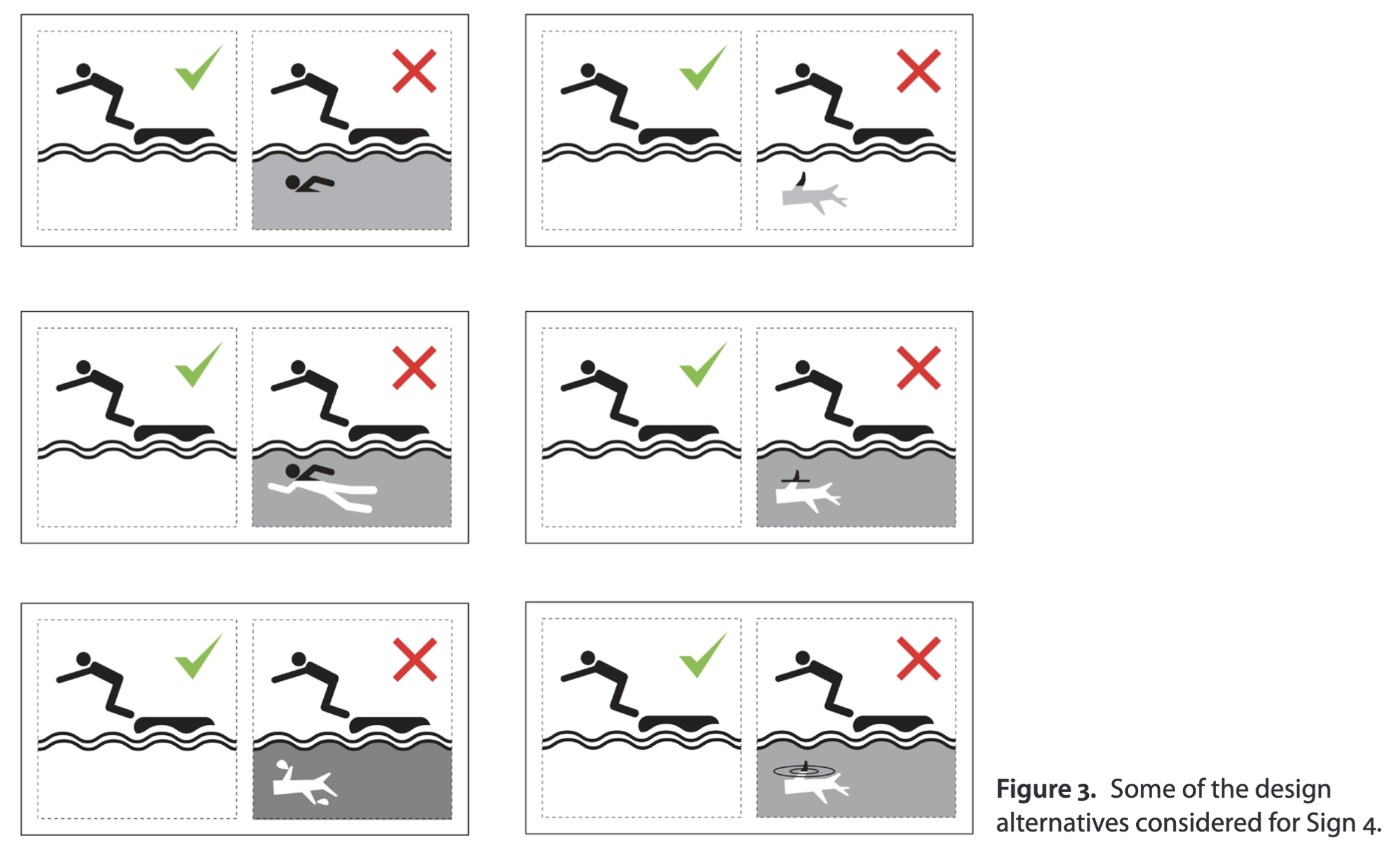
Aim of visuals: For difficult signage circumstances a two-part sign, showing the desired and undesired circumstances with a tick and a cross, can be much more effective than the normal singlepart sign.
People: Pilot study: 33 students from TU Delft, the Netherlands. Main study: 12 Australians. Experiment 2: 156 online respondents
Method: A5 booklet beginning with some examples to indicate what is meant by a description of the elements of the symbol. Following this, each sign was shown, together with a statement of its context, and then three questions were asked. The first was: “What are the elements in this symbol? (Please write what is shown, not what you think it means)”. The second was: “What do you think the symbol means?” and the third was: “What is this symbol telling you to do, or not to do?” Several blank lines were provided for each answer.
Effect of visuals: Through a judicious redesign process we have improved the performance of five of the six proposed water safety signs.
Suggestions for design: The element-description protocol of ISO 9186-2 was instrumental in drawing attention to this single confusing element.
Suggestions for policy: It is our recommendation that ISO should consider implementing an appropriate safety sign protocol to provide for two-part symbols.
Comment: Two-part symbols might be an option for material sorting symbols too?
Acton RB, Vanderlee L, Roberto CA, Hammond D. (2018) ‘Consumer perceptions of specific design characteristics for front-of-package nutrition labels’. Health education research. 33(2), 167-174. [DOI].
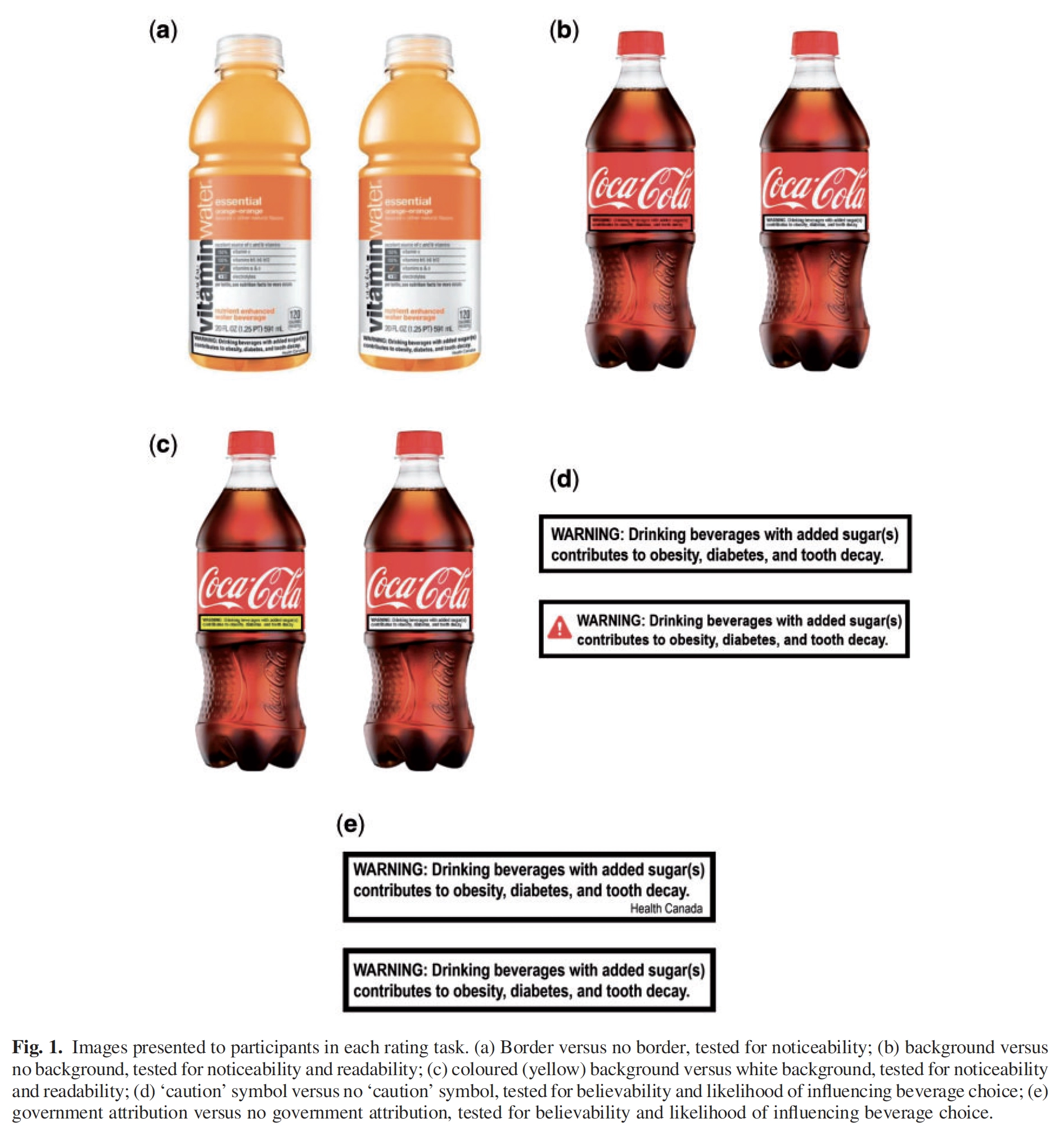
Aim of visuals: Examining the impact of specific design characteristics for front-of-package (FOP) labels.
People: 234 people, Canada.
Method: Shopping mall interviews. Rating tasks on a laptop. Design characteristics (border, background presence, background colour, ‘caution’ symbol and government attribution) were rated on their noticeability, readability, believability and likelihood of changing
their beverage choice.
Effect of visuals: Effect of labels was generally similar across sociodemographic groups. Basic design features may enhance the efficacy of Front of packaging (FOP) labels.
Suggestions for design: -
Suggestions for policy: To date, most nutrition labelling regulations do not reflect best practices in product labelling design; e.g. most current nutrition panels continue to use black and white text-only designs and fail to incorporate contrasting colours or intuitive
symbols.
Comment: The resolution and design-quality of the image is too low: the texts cannot be read, and the shape of the labels does not fit the bottle-perspective. Ranking and preferences as measures. Not performance.
Davies S, Haines H, Norris B, Wilson JR. (1998) ‘Safety pictograms: are they getting the message across?’. Applied Ergonomics . 29(1), 1523. [DOI].
Aim of visuals: The role of pictograms in conveying consumer safety information.
People: UK. Study 1: 325 participants. Study 2: 70 parents + 25 male non-parents as control group.
Method: Thirteen pictograms related to consumer products were chosen and presented alongside photographs of an example of the type of products on which they would be used. Questionnaire.
Effect of visuals: Of the 13 tested, seven were correctly understood by less than 29% of the sample and only three by over 66%. Results indicated that parents' decisions on toy suitability were influenced by the perceived hazardousness of the product rather than warnings, regardless of their design.
Suggestions for design:
Suggestions for policy: ‘Pictograms and warnings should not, in general, be used as a tool to improve consumer education over safety issues, but are probably best used as a reinforcement and reminder of already established safety messages.’
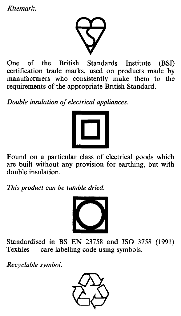
Comment: The recyclable symbol was correctly interpreted in study 1 by 59%. 33% had it wrong. Page 22 states: ‘The literature highlights the fact that very few pictograms are universally understood.’
Gantiva C, Illidge-Cortes J, González-Millares D, Maldonado-Hoyos V, Valencia L. (2024) ‘Health warning labels on cannabis products. What is the best design?’. International Journal of Drug Policy. 126, 104355. [DOI].
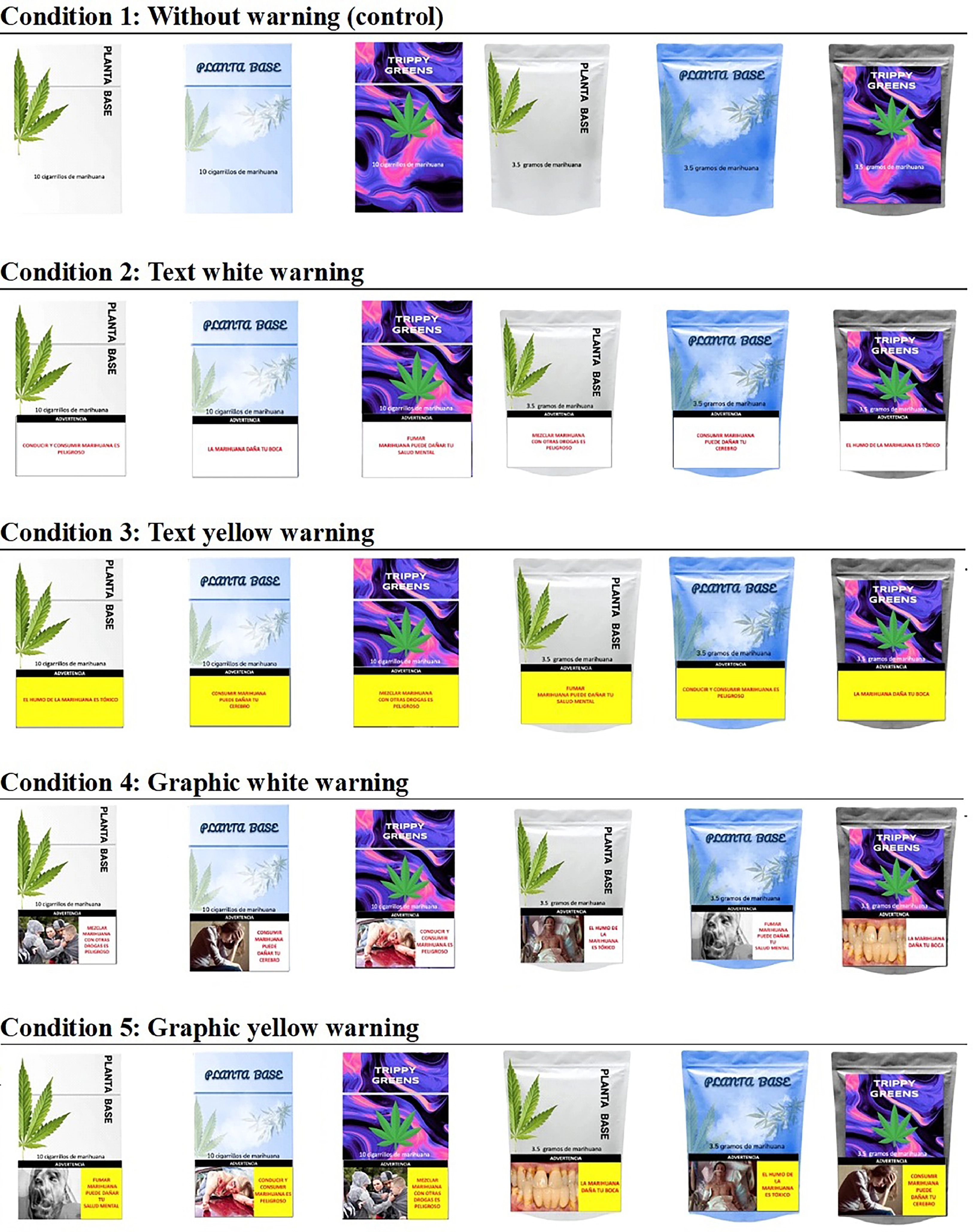
Aim of visuals: different health warning label designs (pictorial vs text-only,
background color, warning themes) on cannabis products.
People: Colombia, N=533
Method: Online study. Five package conditions: without warning, text-only white warning, text-
only yellow warning, pictorial white warning, and pictorial yellow warning.
Effect of visuals: Pictorial health warnings were generally the most effective. Our results suggest that graphic yellow warnings are the most effective in communicating the risks of cannabis use. The use
of these designs diminishes product appeal, increases perceived addictiveness and harm perception, and discourages intention to try them and grab attention.
Suggestions for design:
Suggestions for policy:
Comment: This conclusion might be because the ‘Graphic yellow warning’ is the most salient, especially in combination with the photograph? Self-reported online measures ...