| Compiled by: Karel van der Waarde 2024 | |
| | |
| |
| | |
| Colofon & notes | |
|
|
Design Process: Pictograms
The articles below focus on the process of designing icons. Three practical projects show exemplary design processes: Buro Mijksenaar (Amsterdam), Studio LR (Edinburgh), and Opus International Consultants (New Zealand).
A study in 1993 showed the value of participatory design for traffic signs (Hoekstra, Williams, Green, 1993). The results should be interpreted with care. The visual quality of the investigated labels varied substantially.
The International Institute for Information Design has supported several global projects in this area. The most noticeable are:
Nora Olgyay’s IIID Safety symbol system.
and the Guemil Icons for Emergency project by Prof. Dr. Rodrigo Ramirez.
ISO 22727:2007 suggests that for every new public information symbol it is essential to define a meaning, a function, and a description of the image contents.
Collaud R, Reppa I, Défayes L, McDougall S, Henchoz N, Sonderegger A. (2022) ‘Design standards for icons: The independent role of aesthetics, visual complexity and concreteness in icon design and icon understanding’. Displays. 74, 102290. [DOI].
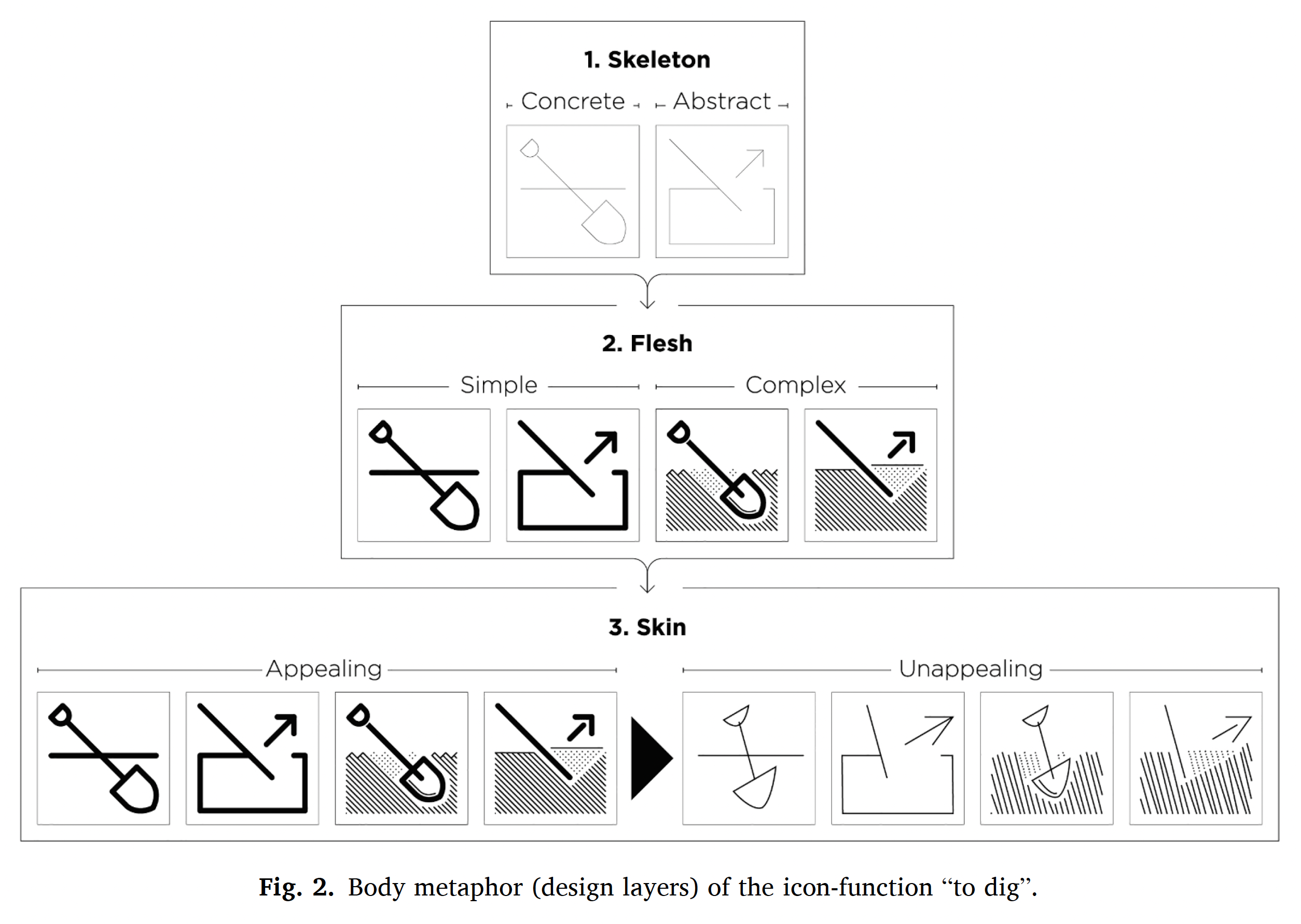
Main points: Icons vary simultaneously across different icon characteristics. 64 icons varied independently along each characteristic. The article is an attempt to systematically define and empirically evaluate recommendations for icon design in a scientific context. The authors provide guidelines for designing icons for research purposes.
Comment: The separation of ‘concreteness’, ‘complexity’, and ‘aesthetics’ might be useful?
Hou G, Hu Y. (2023) ‘Designing Combinations of Pictogram and Text Size for Icons: Effects of Text Size, Pictogram Size, and Familiarity on Older Adults’ Visual Search Performance’. Human Factors. 65(8), 1577–1595. [DOI].
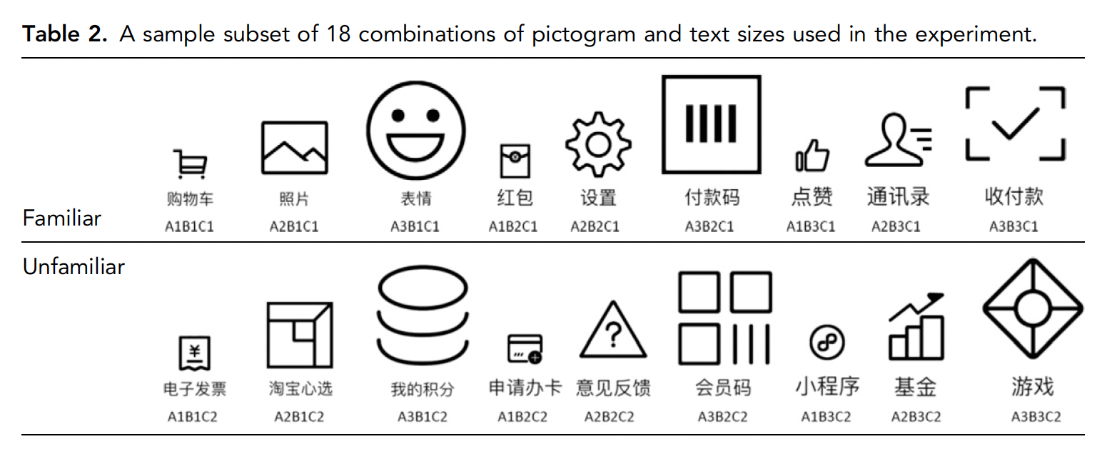
Aim of visuals: Pictograms and text sizes for mobile apps.
People: Older adults, China.
Method: Online survey: 78 participants + eyemovement study: 48 participants.
Effect of visuals: 204 pictograms were included.
Suggestions for design:
Suggestions for policy:
Comment: Text is in Chinese.
Chi C-F, Dewi RS, Samali P, Hsieh D-Y. (2019) ‘Preference ranking test for different icon design formats for smart living room and bathroom functions’. Applied ergonomics. 91, 102891. [DOI].
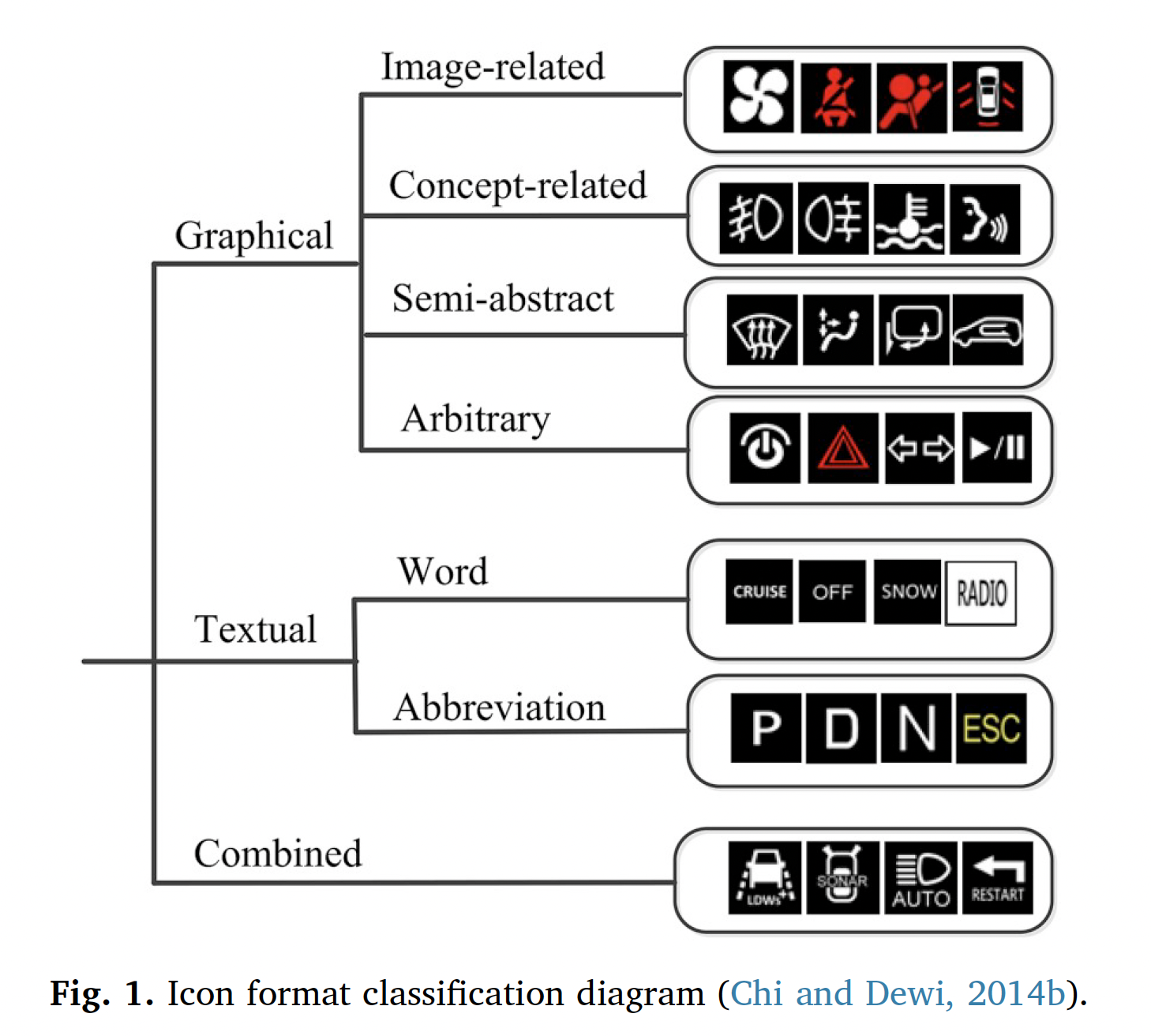
Main points: The authors suggest: ‘it is worthwhile to generate seven icon formats for a given function and chose the most preferred based on the ranking test result’. Nine out of 20 functions had the combined icon format ranked as the most preferred.
Comment: Interesting to develop 7 options before testing. Preference rankings are not suitable to indicate performance.
Pedersen P. (2019) ‘Legibility of Pharmaceutical Pictograms: Towards defining a paradigm’. Visible language. 53(2), 72-99. [DOI].
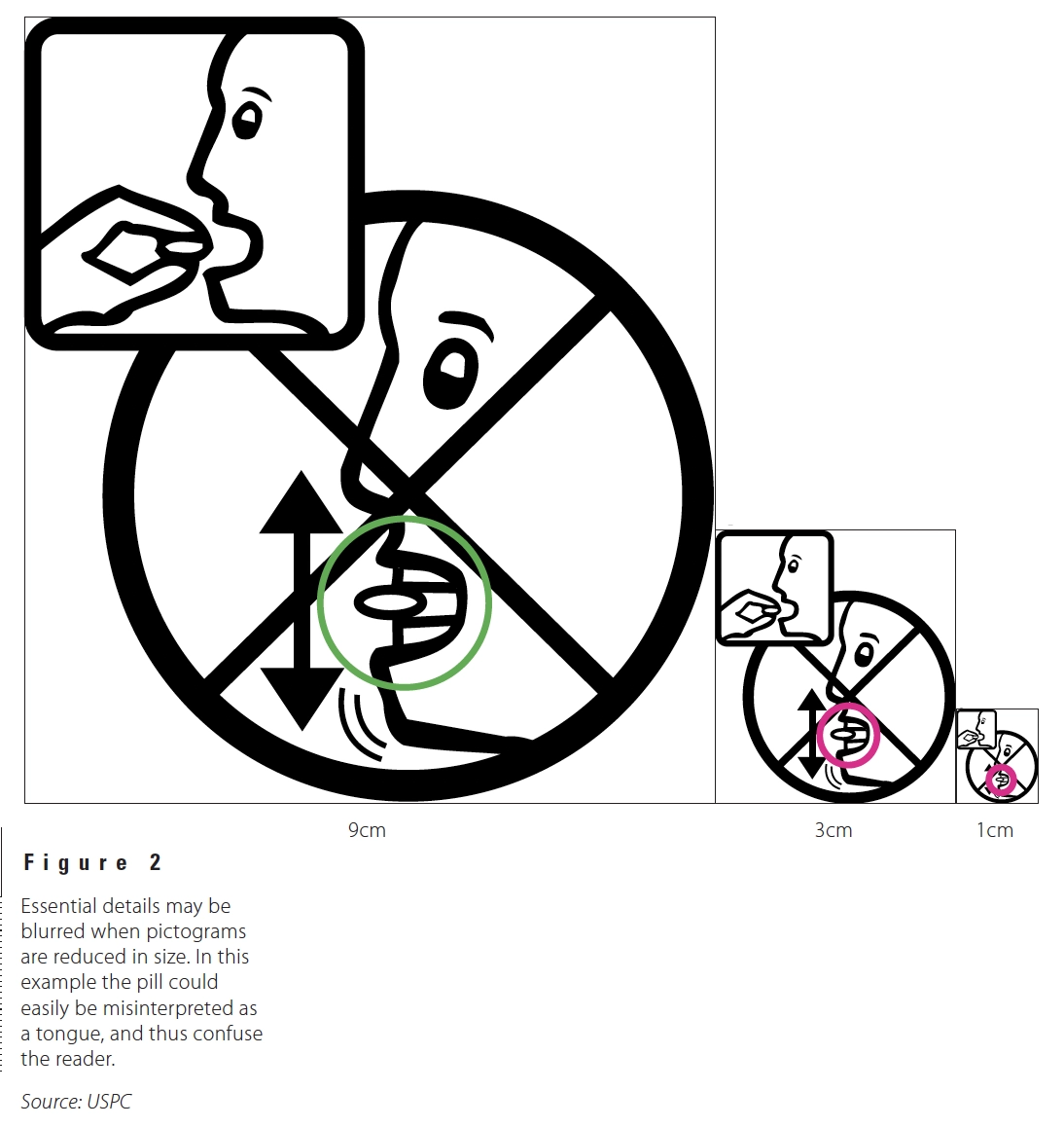
Main points: Legibility of pharmaceuctical pictograms is important. Until now, it has been disregarded.
Comment: Legibility concerns both visibility and familiarity and should be tested as a distinct feature from comprehensibility.
Kovacevic D, Brozovic M, Možina K. (2024) ‘Comprehension of City Map Pictograms Designed for Specific Tourists’ Needs’. ISPRS International Journal of Geo-Information. 13, 137. [DOI].
Aim of visuals: New point-of-interest (POI) pictograms on tourist maps within the Croatian and Slovenian contexts
People: Croatia (n=87) and Slovenia (n=51)
Method: Online questionnaire, A comprehension test was conducted in accordance with ISO standard, subsequently accompanied by an assessment of the attractiveness and noticeability of each pictogram.
Effect of visuals: The results on comprehension and subjective assessments of the pictograms’ qualities revealed insights into the subtle cultural and lifestyle influences on pictogram perception. Differences between Croation and Slovenian interpretations.
Suggestions for design: Despite minor variations, the overall understanding across diverse language groups in his study indicated that pictograms can effectively communicate essential information across cultural boundaries.
Suggestions for policy: The findings of our study suggest that designers and policymakers should integrate multicultural perspectives in the development of signage to cater to a global audience.
Comment: The authors state: ‘showing that the frequency of travel abroad significantly influences their perceived noticeability.’
Bühler D, Hemmert F, Hurtienne J. (2020) ‘Universal and Intuitive? Scientific Guidelines for Icon Design’. MuC '20: Proceedings of Mensch und Computer 2020. 91–103. [DOI]. [The article lists 34 guidelines from scientific research on visual perception, and argues that these guidelines might be a basis for more universal and more intuitive icon designs in the future.]
Collins BL. (1982) ‘The Development and Evaluation of Effective Symbol Signs’. NBS BUILDING SCIENCE SERIES 141. Center for Building Technology National Engineering Laboratory National Bureau of Standards Washington, DC 20234. [PDF]. [Page 76 states: ‘Despite the widespread need for graphic symbols to communicate essential safety, warning, and directional information, various problems have prevented their development and use. These problems arise from the failure to evaluate symbols for both graphic coherence and user effectiveness, and from the current lack of standards for symbols, particularly in the safety information and hazard warning area.’]