| Compiled by: Karel van der Waarde 2024 | |
| | |
| |
| | |
| Colofon & notes | |
|
|
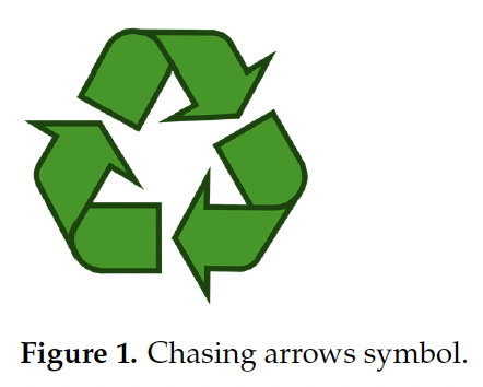
Chasing arrows triangle
The Recycling symbol was designed by Gary Dean Anderson - an architecture student at the University of Southern California in Los Angeles - in 1970. It won a competition that was organised by the Container Corporation of America to promote the recycling of paper. A discussion in 2020 in the United States questions the validity of the symbol.
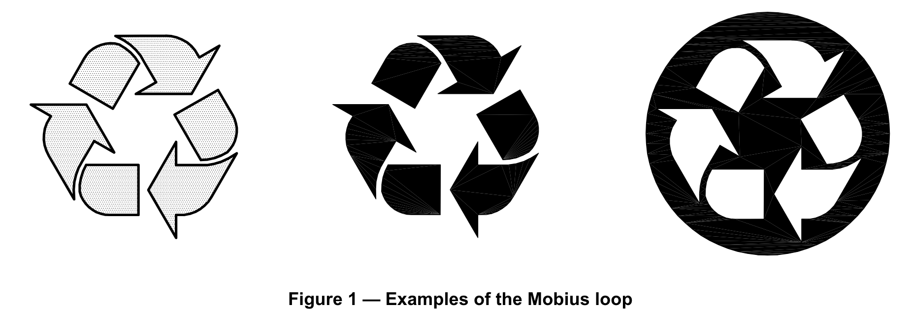
Below are several representations of the triangle as they appear in publications. They look similar, but their details vary substantially: none is the same?
Latkin CA, Dayton L, Yi G, Balaban A. (2022) ‘The (Mis)Understanding of the Symbol Associated with Recycling on Plastic Containers in the US: A Brief Report’. Sustainability. 14, 9636. [DOI].
Aim of visuals: An object with this symbol can be recycled.
People: 808 participants, USA.
Method: Online
Effect of visuals: Understanding: 81.3% reported (incorrectly) that the symbol indicated that the item could definitely be recycled and 16.3% reported that it could probably be recycled.
Suggestions for design: Plastic manufacturers should revise labels about recycling and not disseminate potentially deceptive information about the ability to recycle their products
Suggestions for policy: More effective methods such as extended producer responsibility legislation are needed to reduce plastic pollution + Based on study findings, it is evident that additional training is needed for US residents to understand recycling guidelines.
Comment: As a test method, an online survey with pre-determined multiple choise answers is questionnable.
Tso VBY, Lambreghts CS, Tso S, Mann S, Smith K, Lam M, Tso ACY. (2022) ‘On-pack recycling label in cosmeceutical products in dermatology’. Clinical and Experimental Dermatology. 47, 136–199. [DOI].
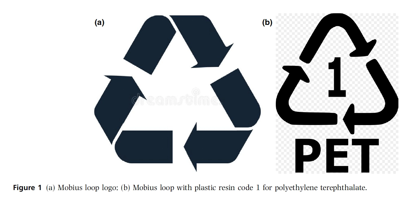
Aim of visuals: ‘The presence of on-pack recycling logos can facilitate both children and adults to rapidly recognize a packaging material’s capability of being recycled.’
People: Children in UK and Singapore: 79 dermatological cosmeceutical products.
Method: Check if they show the mobius loop symbol.
Effect of visuals: Although our study findings showed that a significant proportion of both full-size and sample-size cosmeceutical products do not display the Mobius loop recycling symbol on their packaging material, it should be noted that the absence of an on-package Mobius loop symbol does not denote that the material is not capable of being recycled.
Suggestions for design: Clear displaying of relevant recycling information or symbols on packages will encourage and reinforce positive recycling behaviours in children and adults alike, and prompt clinicians to consider the environmental impact of the products they may use and recommend.
Suggestions for policy:
Comment: This article shows some of the common assumptions about the Mobius Loop logo and the resin codes. The authors mention ‘the universally recognized Mobius loop logo’, and 'many other widely recognized symbols related to recycling or sustainability’. Unfortunately, all evidence suggests that the Mobius loop logo and recycling or systainability symbols are not recognised by substantial parts of societies.
![]()
Buelow S, Lewis H, Sonneveld K. (2010) ‘The Role of Labels in Directing Consumer Packaging Waste’. Management of Environmental Quality. An International Journal. 21(2), 198-213. [DOI].
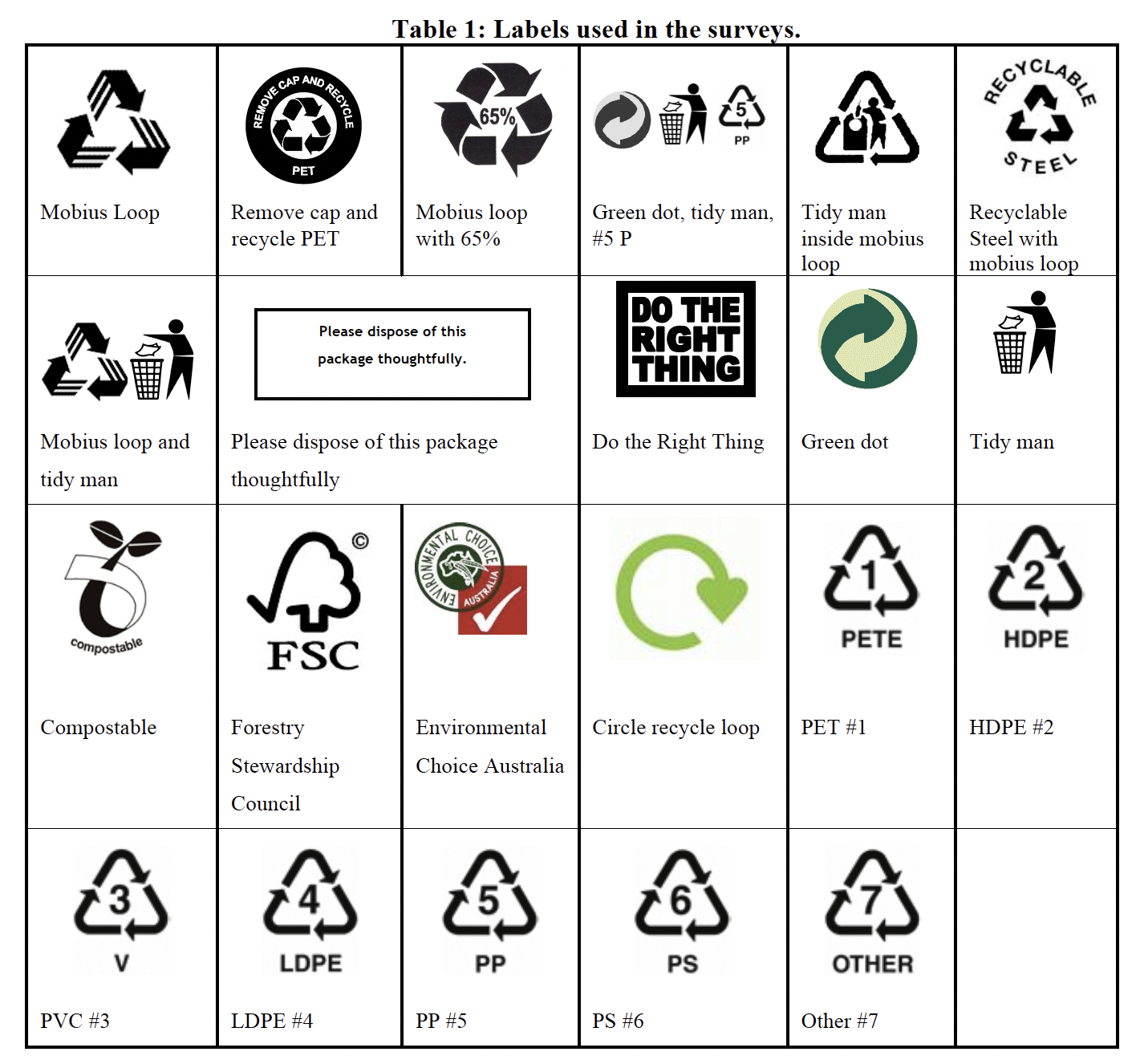
Aim of visuals: Targeted labelling is a viable option that can successfully specify what action consumers need to take to ensure the packaging component ends up in the correct recovery stream.
People: Australia
Method: 88 self administered questionnaires, and 25 face-to-face interviews
Effect of visuals: There was much confusion regarding the mobius loop recycling symbol, with many participants citing
it as the only information that indicates whether a package is recyclable or not.
Suggestions for design: The most easily understood labels were action-oriented with verbs literally telling people what to do, such as the “Remove cap and recycle” and “Recyclable steel” labels. The most mis-understood labels were vague and contradicting, such as the “tidy man” inside the mobius loop and “Do the Right Thing.”
Suggestions for policy: ‘One of the largest barriers to materials being properly sorted for council kerbside collection currently seems to be incorrect, misleading, and vague labelling provided by packaging and product manufacturers.’
Comment: Clear indication that triangular arrows symbols are confusing. In the illustration above, 14 out of 22 investigated labels use this symbol. Some caution: it is not clear what people looked at during the interviews.
ISO 14021. (2016) ‘Environmental labels and declarations — Self-declared environmental claims (Type II environmental labelling)’. International Organization for Standardization. Genève, Switzerland. [Website].
Aim of visuals: To indicate that the marked item or its material is part of a recovery or recycling process. [Defined in ISO 7000, Symbol No. 1135.]
People: None
Method: None
Effect of visuals: None
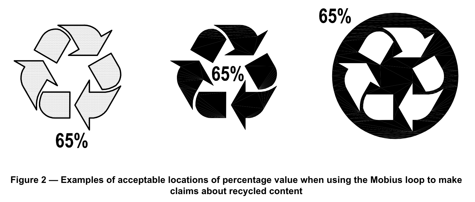
Suggestions for design: The design shall meet the graphical requirements for ISO 7000, Symbol
No. 1135. There should, however, be enough contrast so that the symbol is clear and distinguishable. 7.8.3.2 states: ‘If a symbol is used for a recycled content claim, it shall be the Mobius loop accompanied by a percentage
value stated as “X %”, where X is the recycled content expressed as a whole number calculated in accordance with
7.8.4.’
Suggestions for policy: The symbol ISO 7000 number 1135 differs visually from the visuals in the standard.
Comment: The original intention of this symbol was ‘reduce, reuse, recycle’ and was specifically designed fro paper recycling. ISO gives it a different meaning. Adding a percentage to this symbol is confusing because it is not clear if this percentage is only applicable to the packaging or to the whole product.