| Compiled by: Karel van der Waarde 2024 | |
| | |
| |
| | |
| Colofon & notes | |
|
|
Medicine labels
The use of labels on medicines and medical devices has a long history. Many attempts have been made to add symbols. Recently, the International Pharmaceutical Federation (FIP) decided to take their collection offline. A more extensive bibliography on the use of pictograms in medicine labels is available.
The term ‘labelling’ is interpreted as ‘all information that accompanies a medicine’. The obligatory European QRD-template includes one sentence about disposal of medicines that appears in all package inserts: ‘Do not throw away any medicines via wastewater or household waste. Ask your pharmacist how to throw away medicines you no longer use. These measures will help protect the environment.’
Gerhart JM, Spriggs, H, Hampton TW, Hoy RmB, Strohclic, AY, Proulx S, Goetchius DB. (2015) ‘Applying human factors to develop an improved package design for (Rx) medication drug labels in a pharmacy setting’. Journal of Safety Research. 55, 177-184. [DOI].
Aim of visuals: Improve the accurate selection of medications from pharmacy shelves. The article applies medication safety and human factors engineering expertise and methodologies to develop an improved label.
design
People: 1: 4 pharmacists & 4 pharmacy technicians (Boston, USA). 2: 10 pharmacists & 15 technicians.
Method: 1: Formative evaluations: Selecting medicines + reading from a distance + preference. 2: validation testing: fill 40 prescriptions (several interuptions) + questionnaire.
Effect of visuals: Participants unanimously reported that the proposed label design would effectively enable them to correctly identify the medication.
Suggestions for design: The redesigned label should improve the accurate selection of medications from pharmacy shelves.
Suggestions for policy:
Comment: The application of human factors engineering and usability studies is interesting.
Aceves‑Gonzalez C, Caro‑Rojas A, Rey‑Galindo JA, Aristizabal‑Ruiz L, Hernández‑Cruz K. (2024) ‘Estimating the impact of label design on reducing the risk of medication errors by applying HEART in drug administration’. European Journal of Clinical Pharmacology. 80, 575–588. [DOI].
Aim of visuals: Reducing medication errors. Medication label design is often a contributing factor to medication errors.
People: 8 experienced nurses in Bogota (Colombia).
Method: human error assessment and reduction technique (HEART)
Effect of visuals: Including labelling design based on HFE might help increase human reliability when administering medications under critical conditions.
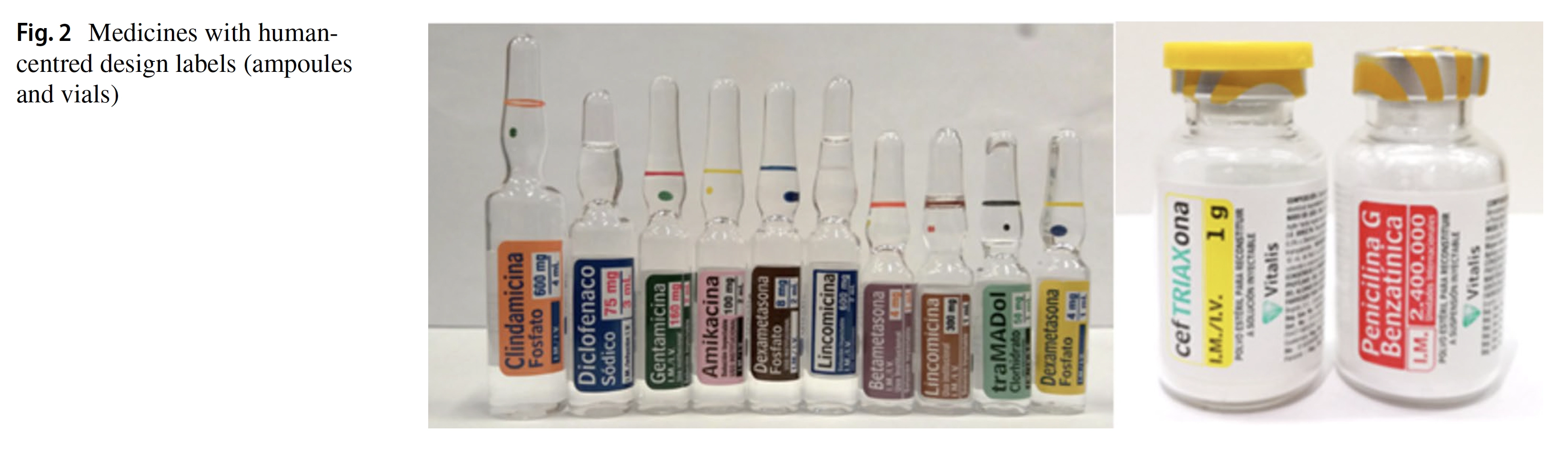
Suggestions for design: The design of the ampoules is not described: it is not clear what the motivations for the visual decisions have been.
Suggestions for policy: -
Comment: The article makes a worrying claim: ‘the current study is the first proactive analysis of human reliability analysis to estimate the influence of label design in the drug administration process using HEART.’ The good thing is that only 8 nurses were involved to substantially reduce the risks of medication errors.
Seo DC, Ladoni M, Brunk, E, Becker MW, Bix L. (2017) ‘Do Healthcare Professionals Comprehend Standardized Symbols Present on Medical Device Packaging?: An Important Factor in the Fight Over Label Space’. Packaging Technology and Science. 30, 61–73. [DOI].
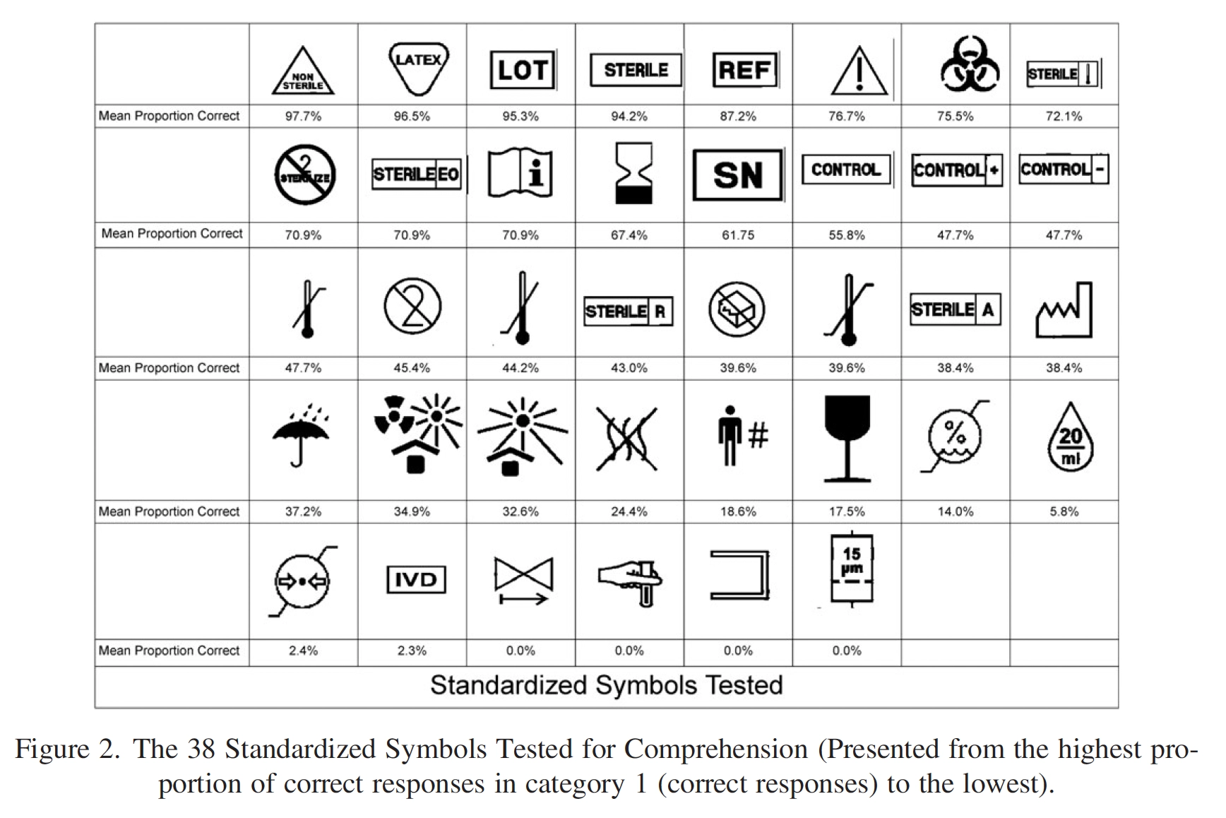
Aim of visuals: Internationally standardized symbols placed on medical device packaging.
People: 86 healthcare providers (USA). (Average experience: 20 years).
Method: Comprehension test of 38 symbols.
Effect of visuals: 6 passed 85% understanding level. 5 out of these 6 had text within them. 3 were critically confusing. Current stand alone symbols are not interpreted correctly by healthcare providers.
Suggestions for design: The quality of the visual design of these symbols is not discussed.
Suggestions for policy: Symbols without text are not readily understood.
Comment: It is likely that the text in the symbols was the main success-factor. Clear indication that symbols without text - even for very experienced professionals - are very difficult to comprehend.
Lusk C, Catchpole K, Neyens DM, Goel S, Graham R, Elrod N, Paintlia A, Alfred M, Joseph A, Jaruzel C, Tobin C, Heinke T, Abernathy J. (2022) ‘Improving safety in the operating room: Medication icon labels increase visibility and discrimination’. Applied Ergonomics. 104, 103831. [DOI].
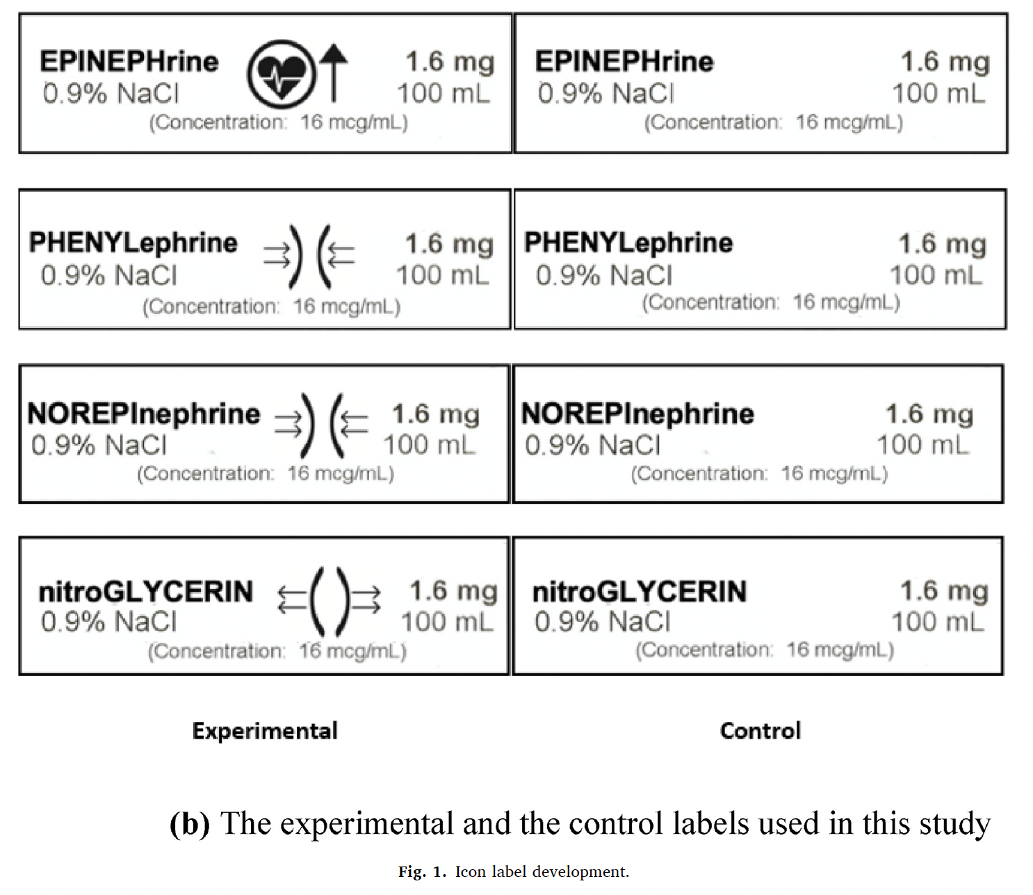
Aim of visuals: The addition of icons to medication labels in an operating room setting could add additional visual cues to the label, allowing for improved discrimination, visibility, and easily processed information that might reduce medication administration errors.
People: 22 medical students, one anesthesiologist, and one research professional, USA.
Method: Correctly identify infusion bag with labels: distance and lighting conditions varied.
Effect of visuals: Carefully designed icons may offer an additional method for identifying medications, and thus reducing medication administration errors. The presence of icons significantly increased the distance at which IV medications could be identified.
Suggestions for design: A set of icons was designed for use on IV bags through an iterative process, that included anesthesiologists, designers, pharmacists, certified registered nurse anesthetists (CRNAs), and human factors (HF) engineers.
Suggestions for policy: -
Comment: Importance of participatory design. And: ‘labels, as the combination of pictogram and text on the icon label may enhance readability, legibility, and visual search performance of anesthesia providers.’
Humphrey G, Keane C, Gharibans A, Andrews CN, Benitez A, Mousa H, O'Grady G. (2024) ‘Designing, Developing, and Validating a Set of Standardized Pictograms to Support Pediatric-Reported Gastroduodenal Symptoms’. The journal of pediatrics. 267, 113922. [DOI].
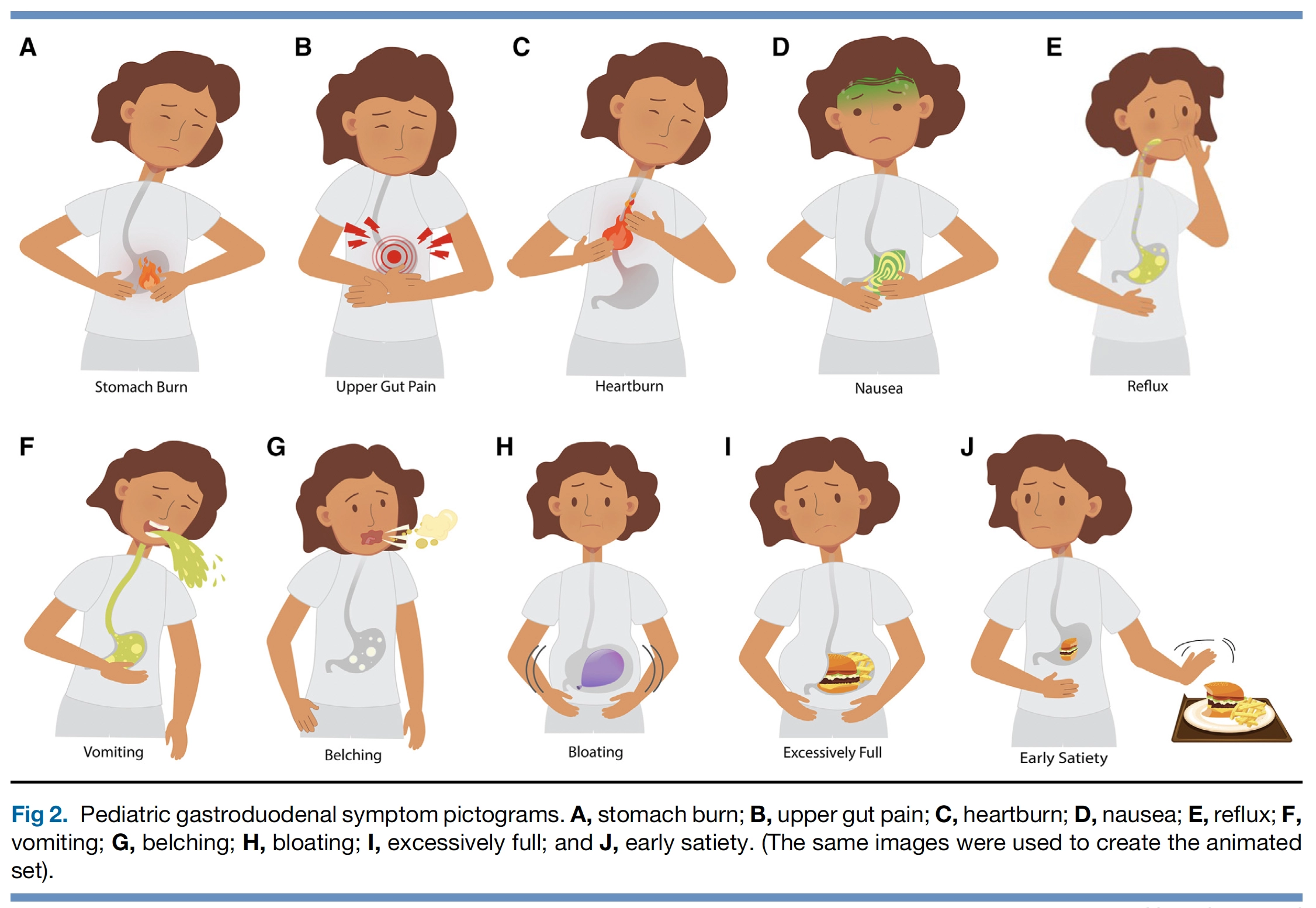
Aim of visuals: A set of static and animated gastroduodenal symptom pictograms for children.
People: 126 children in New Zealand.
Method: Co-creation with 8 children, 69 children took part in the online survey, and 49 in the preference test.
Effect of visuals: The cocreation phase resulted in the symptom concept confirmation and design of 10 acceptable static and animated gastroduodenal pictograms with high face and content validity when evaluated with children aged 6-18. Validity was superior when children reported more problematic symptoms.
Suggestions for design: Further validation studies should be considered in pediatric patients with
greater symptom burden, a larger younger population, diverse cultural and ethnic groups, and populations from
different jurisdictions.
Suggestions for policy: -
Comment: The study used 3 steps. 1. Co-creation. 2. Online survey. 3. Preference test. This shows that a substantial part of the process involves people. The article does not mention if the texts under the pictograms was helpful or not.
Mohan A, Riley MB, Boyington D, Johnston P, Trochez K, Jennings C, Mashburn J, Kripalani S. (2013) ‘Development of a Patient-
Centered Bilingual Prescription Drug Label’. Journal of Health Communication. 18:sup1, 49-61. [DOI].
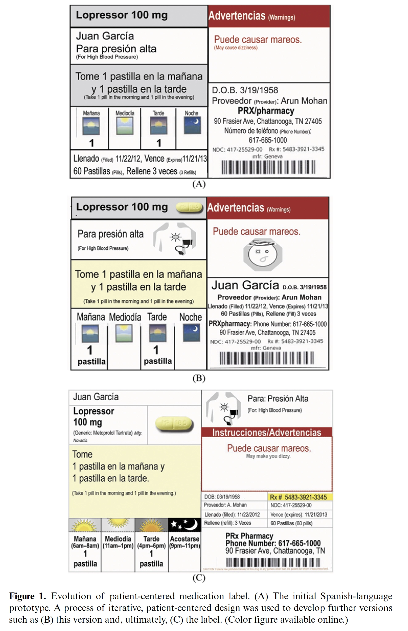
Aim of visuals: To improve understanding of prescription drug labels.
People: 57 participants: patients and pharmacists in Tennessee (USA).
Method: five focus groups with patients (two in English and three in Spanish), one focus group with pharmacists, and five in-depth personal interviews (3 patients and 2 pharmacists).
Effect of visuals: Patients strongly preferred labels that grouped patient-relevant content, highlighted key information, and included drug indication icons.
Suggestions for design: ‘Plain language medication instructions and illustrations enhance communication about prescription medications.’ (page 59)
Suggestions for policy: Regulatory and professional agencies should provide guidance to pharmacists to ensure that warnings are well understood and are appropriately associated with the medication.
Comment: The set up and approach is good. However, participants were asked for preferences and advice on how to present information (page 52). There were no performance measures?
Saif S, Bui TTT, Quintana Y. (2024) ‘Evaluation of the design and structure of electronic medication labels to improve patient health knowledge and safety: a systematic review’. Systematic reviews. (13)12. [DOI].
Method: Systematic literature review
Effect of visuals: The utilization of patientcentered language, pictograms/graphics, color/white space, or font optimization was seen to have the most impact on patient comprehension.
Suggestions for design: ‘Evidence-based design principles can be used to standardize the structure of label content for both print and electronic devices. Including pictograms on the labels was particularly valuable in communicating instructions on how to take medicine and in emphasizing the necessity of completing the course.’
Suggestions for policy: it is of particular importance to pay attention to label layout and how to emphasize critical medication information to improve label readability
Comment: Standard issues with systematic reviews of pictograms: variation in visual quality, participants, situations, and tasks make a direct comparison of the experimental results questionable.