| Compiled by: Karel van der Waarde 2024 | |
| | |
| |
| | |
| Colofon & notes | |
|
|
Signage and wayfinding
This page about signage and wayfinding is stricktly spoken not about labelling. It includes articles about signs in a public space that direct, warn, inform, identifies, or instruct people. The combination of images and text makes it worth to include this page. If the findings can be directly applied to labels remains to be investigated.
Hung Y-H, Tan Y. (2024) ‘How symbol and text combine to promote sign comprehension: Evidence
from eye-tracking’. Displays. 83, 102709. [DOI].
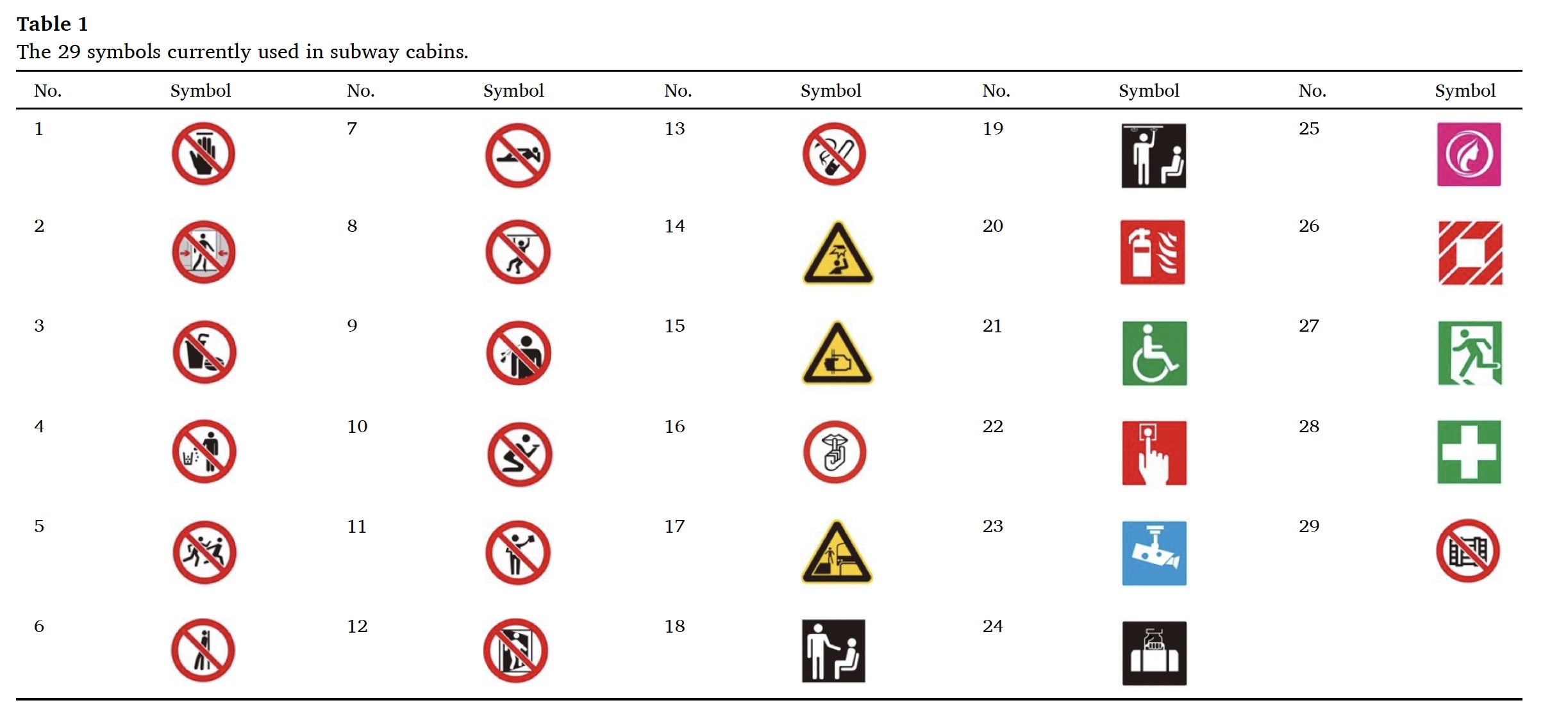
Aim of visuals: Why does text exhibit shorter comprehension reaction time than symbols? When combining symbols with text, what visual cognitive processing strategies do observers employ to facilitate the rapid comprehension of sign meaning, given the varying levels of comprehension?
People: 65 Chinese students + 19 Chinese students.
Method: 65 questionnaires, 19 eye-tracking studies. 29 symbols in three conditions: text-only, symbol-only, and symbol with text.
Effect of visuals: Text only is fastest, followed by symbol and text. The study revealed that the lower the comprehension level of symbols, the higher the proportion of time spent observing the text area. But when symbols are of high comprehension level, nearly half of the observers disregard the text, confidently grasping the meaning of the
sign solely through symbols. These findings strongly affirm that observers adjust their text-viewing strategies based on the ease of comprehension of the symbols.
Suggestions for design: ‘adding text to signs appears to be a practical, straightforward, and effective solution.’
Suggestions for policy: This study found that when symbols and text are combined, regardless of the symbol’s comprehension level, people invariably observe the symbol first and then the text.
Comment: Combining text and images seems most effective: images to attract the attention, text to support the interpretation.
Studio LR. (2019) ‘Inclusive Symbols. Co-designed with people living with dementia’. Edinburgh: Studio LR. [Website].
Aim of visuals: The intention to produce a new ‘inclusive symbols’ set that could be adopted across society.
People: Involvement throughout. Also 83 people with dementia. 590 primary school children.
Method: Sprint workshops, focus groups, online surveys, in-situ testing.
Effect of visuals:
Suggestions for design:
Suggestions for policy:
Comment: An example of a co-design project. The symbols were tested in several different ways. ‘Feedback was unanimous that symbols are easier to understand with the support of simple words that describe the facility, place or service.’ (Page 12).
Buro Mijksenaar. (2021) ‘Beyond the binary’. Amsterdam: Buro Mijksenaar. [Website].
Aim of visuals: Setting the wayfinding standard for inclusive restrooms
People: 223 people in Amsterdam, 189 people online.
Method: Online preference vote: 4 options. Online survey. Observation study at Schiphol airport.
Effect of visuals: A shift of focus is necessary: from the person using the restroom to the functions of the restroom.
Suggestions for design: ‘When initially approached to design a universal all-gender restroom pictogram, we quickly realized that deeper and more thoughtful consideration was needed than a single pictogram could provide.’
Suggestions for policy: Culture, context and users and should be taken into consideration when choosing how to handle the implementation of all-gender restrooms.
Comment: The usability test at Schiphol airport shows the importance of testing symbols in its context. The importance of architecture is outlined.
Lee S, Dazkir SS, Paik HS, Coskun Y. (2014) ‘Comprehensibility of universal healthcare symbols for wayfinding in healthcare facilities’. Applied ergonomics. 45, 878e885. [DOI].
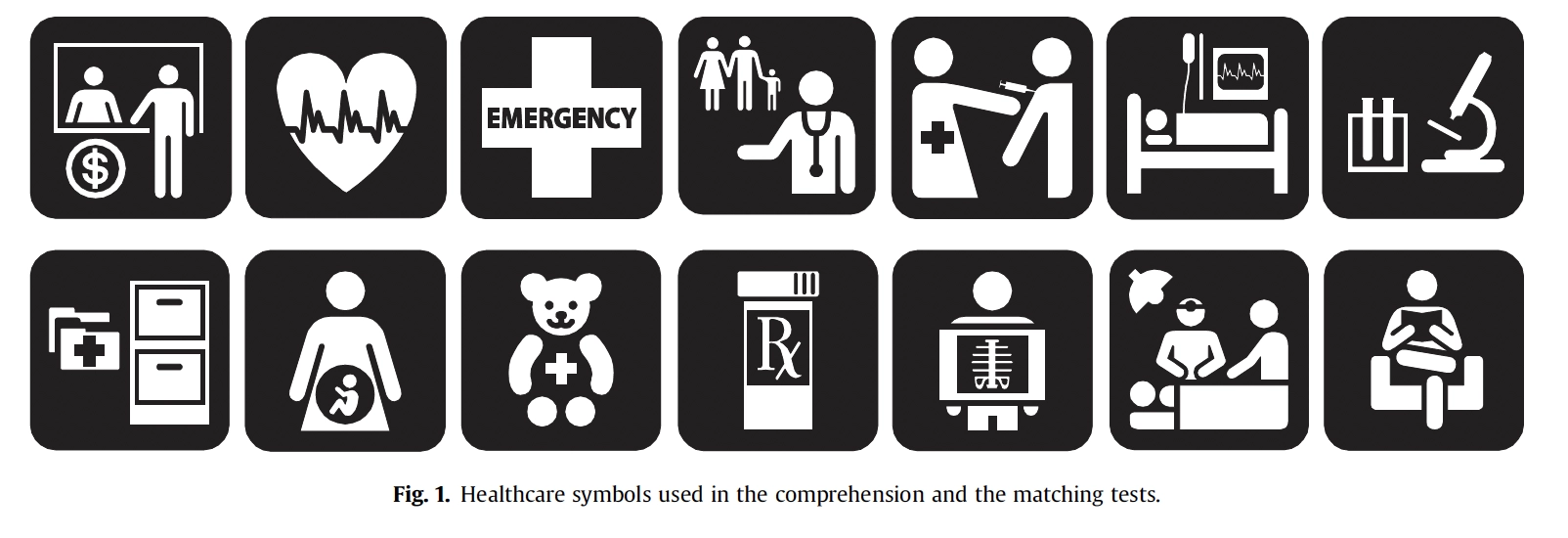
Aim of visuals: Comprehension of some existing healthcare graphical symbols in three different countries: the United States, South Korea, and Turkey.
People: 180 people. 60 in each country. 3 age groups: 18-30, 31-50, and over 50, 10 male & 10 female.
Method: Comprehension test, matching test, judgement test.
Effect of visuals: Results from the judgment test revealed that people comprehended symbol design from their own country significantly better. However, many symbols did poorly in one or two of the three countries, revealing a need for designing better symbols that would address people with different nationalities and cultural backgrounds.
Suggestions for design: Symbol design should consider cultural diversity so that symbols can be comprehended
universally. It also shows that it is a great challenge for designers to devise universal symbols which can be understood accurately by people of various cultural backgrounds. (page 884)
Suggestions for policy:
Comment: Cultural differences affect comprehension of symbols. This study suggests that universal healthcare symbols should be tested in different countries to make sure they can be comprehended across countries.
NHS (2005) ‘Wayfinding. Effective wayfinding and signing systems’. London: the Stationary Office. [Website]. [This document assesses and suggests improvements to wayfinding systems at healthcare sites. The design process includes a substantial section on testing (page 115). These test might be interesting for the signage in recycling centers.]