| Compiled by: Karel van der Waarde 2024 | |
| | |
| |
| | |
| Colofon & notes | |
|
|
Design process: Typography and text
Alton Mackey M, Metz M. (2009) ‘Ease of reading of mandatory information on Canadian food product labels’. International Journal of Consumer Studies. 33(4), 369–381. [DOI].
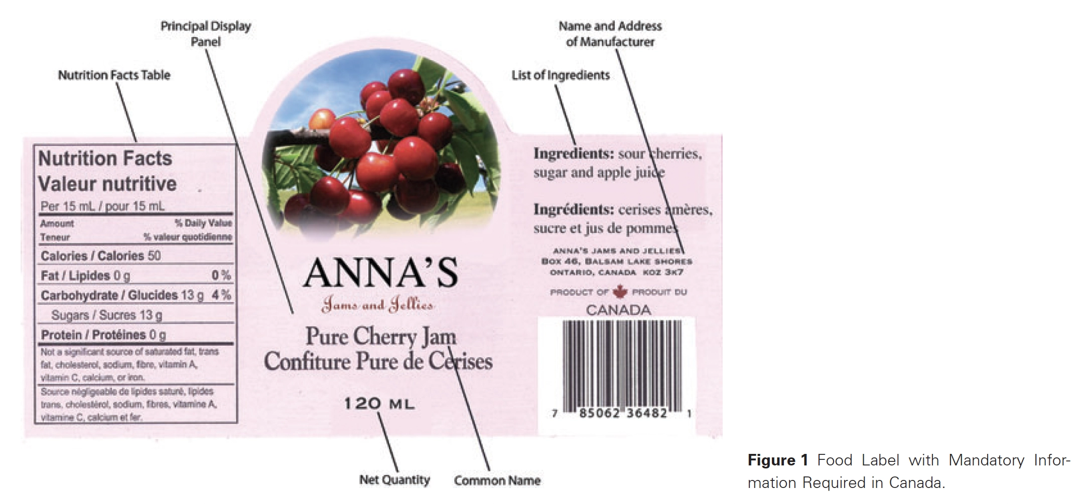
Aim of visuals: Canadian food product labels.
People: Canada: Four focus groups, 50 participants in total.
Method: Analysis of the labels of 100 food samples.
Effect of visuals: Seven percent of the ingredient lists were easy to read; 26% were difficult to read and 67% were very difficult to read.
Suggestions for design: Typography that is less than optimal places barriers to ease of finding and reading important food label information.
Suggestions for policy: Canadian consumers echo consumers in 28 European countries who find label information difficult to find and to read and want clear guidelines/regulations on the placement and the typography of mandatory
food label components.
Comment: The review is based on Miles Tinker’s work in 1940 and 1965. It is not appropriate anymore: printing technology, typefaces, continuous text, test conditions, participants, and test materials are all different.